
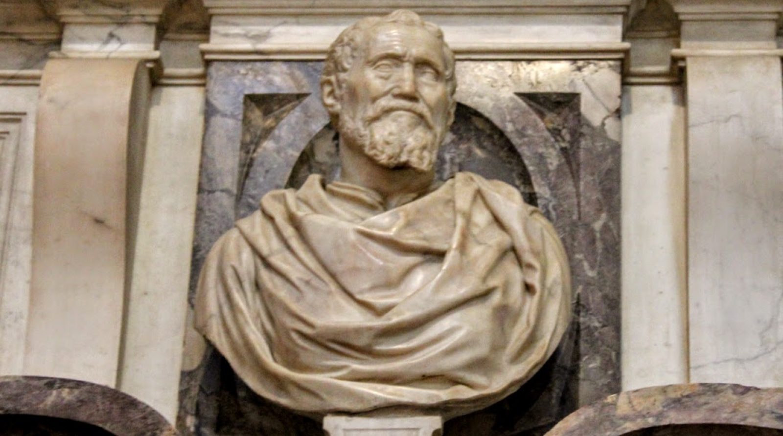
Come sono stati dipinti gli affreschi della volta della Sistina: pigmenti, colori e pennellate
Quando oggi alzate gli occhi verso la volta della Cappella Sistina, venite attratti dalla potenza delle figure, dalla monumentalità dei corpi, dalla complessità delle scene e dalla straordinaria luminosità dell’insieme.
Provate a soffermarvi anche su ciò che accade sotto quella superficie apparentemente compatta, perché ogni colore che vedete, ogni variazione di tono e ogni pennellata che contribuisce a costruire una figura sono il risultato di una precisa scelta tecnica, maturata mentre lavoravo sull’intonaco fresco e mentre imparavo, giorno dopo giorno, a conoscere sempre meglio i materiali con cui stavo costruendo quelle immagini.
Non ho mai considerato il colore come un semplice elemento decorativo da aggiungere a un disegno già compiuto. Per me il colore doveva avere una funzione strutturale, doveva contribuire a dare peso e consistenza ai corpi, suggerire la profondità, rendere percepibile la luce e soprattutto trasformare una superficie curva e immobile in uno spazio capace di accogliere figure che sembrassero quasi uscire dall’architettura.

La tavolozza che utilizzai sulla volta
La tavolozza che impiegai nella volta della Cappella Sistina era composta principalmente dai pigmenti tradizionalmente utilizzati nella pittura a buon fresco, quindi terre e ossidi, ai quali si aggiungevano il bianco di San Giovanni e il nero di vite. Erano tutti materiali che consentivano di costruire una gamma cromatica molto più ricca di quanto potrebbe suggerire, a un primo sguardo, la relativa semplicità dei pigmenti disponibili.
Tra gli azzurri, il lapislazzuli era il colore più costoso. Dato che papa Giulio II della Rovere pretendeva che anticipassi le palanche dei colori, ne feci un utilizzi parsimonioso. Le ampie campiture colorate di azzurro, nella colta, le realizzai con lo smaltino molto più a buon mercato.
All’inizio del lavoro sulla volta la mia tavolozza era più ampia e sperimentale. Infatti nella prima parte della volta, tra Storie di Noè e le lunette sottostanti, utilizzai alcuni pigmenti che la tradizione tecnica, a partire da Cennino Cennini, considerava poco adatti alla pittura a fresco.
Tra questi vi erano il resinaro di rame, presente nelle lunette di Eleazar, Araz e Zorobabel, la malachite e alcuni pigmenti rossi come il cinabro e il minio, spesso mescolati con le terre per ottenere particolari variazioni cromatiche.
Quella scelta nasceva soprattutto dalla voglia di ampliare la tavolozza. Non volevo infatti che la tecnica del fresco diventasse un limite alla varietà delle immagini che avevo in mente. Il tempo e l’esperienza mi avrebbero insegnato quanto alcuni di quei materiali fossero vulnerabili all’umidità.
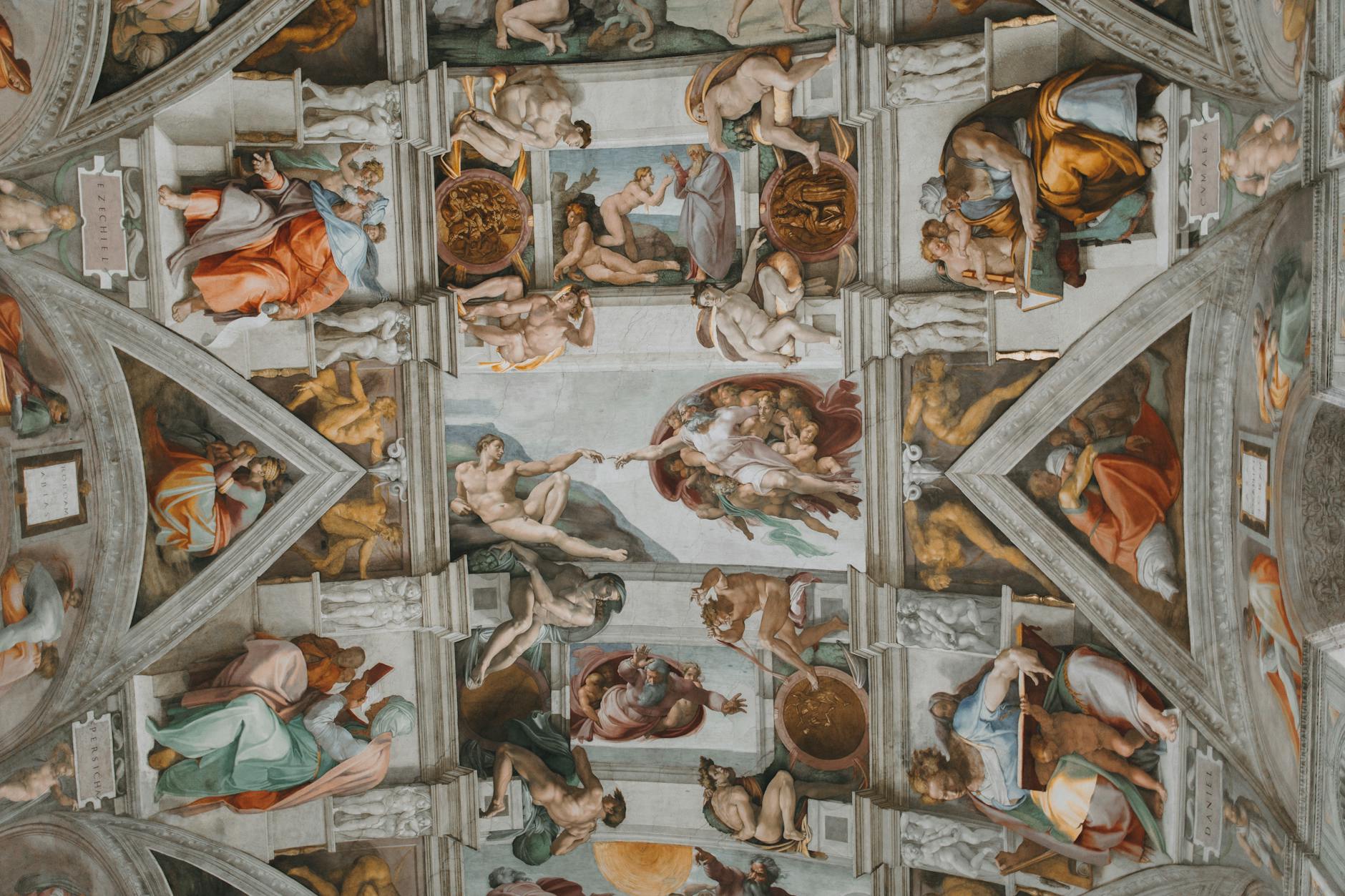
Il Diluvio mi insegnò quanto fosse fragile la pittura
Le prime scene della volta conservano ancora le tracce di un modo di dipingere leggermente diverso da quello che avrei adottato più avanti. Nel Diluvio il colore presenta ancora una certa consistenza e un minimo spessore delle pennellate che progressivamente sarebbe venuto meno con l’avanzare del lavoro.
L’umidità e le infiltrazioni d’acqua danneggiarono alcune parti della pittura e mi costrinsero a intervenire, tanto che il Diluvio dovette essere in gran parte rifatto e anche l’Ebbrezza di Noè dovette essere ritoccata a secco.
Quell’esperienza fu importante perché mi rese ancora più consapevole della vulnerabilità di determinati pigmenti e delle conseguenze che l’umidità poteva avere sulla superficie dipinta.
A partire dal Peccato Originale, alcuni dei pigmenti che avevo utilizzato nella prima parte della volta scomparvero dalla mia tavolozza e il modo stesso di stendere il colore cambiò progressivamente, fino a diventare sempre più sottile e liquido.

Non volevo coprire l’intonaco: volevo farlo respirare
Non ero solito stendere il colore in modo pesante e coprente. Preferivo di gran lunga velature estremamente diluite che venivano sovrapposte una all’altra, in un procedimento che per certi aspetti può ricordare quello dell’acquerello, perché il tono sottostante rimaneva percepibile e partecipava alla costruzione dell’immagine.
Questa trasparenza era per me fondamentale. Volevo semplicemente depositare una quantità di colore sulla superficie dell’intonaco, ma costruire lentamente la forma attraverso una successione di passaggi, lasciando che il colore sottostante, la superficie e la luce contribuissero insieme al risultato finale.
Con il procedere dei lavori questa caratteristica diventò sempre più evidente: dalla relativa consistenza delle prime scene arrivai a stesure progressivamente più liquide, fino a raggiungere, nelle zone terminali della volta, una pittura estremamente sottile e quasi acquerellata.
Grazie proprio alla ridotta quantità di materia pittorica, la superficie nel corso dei secoli ha potuto conservare nel tempo una straordinaria leggibilità, nonostante le infiltrazioni d’acqua e la formazione di sali abbiano in alcuni punti aggredito e sgranato la superficie dipinta.

Per me il colore serviva a costruire la luce
Il colore stesso doveva partecipare alla costruzione della forma e contribuire a rendere visibile il modo in cui la luce si posa sui corpi.
Nella mia concezione, la luce proveniva idealmente da un punto indefinito collocato oltre e sopra l’altare e raggiungeva le figure secondo angolazioni differenti, facendo emergere muscoli, torsioni, volumi e panneggi e creando una continuità luminosa capace di attraversare l’intera architettura della volta.
Per questo il colore ha nella Sistina una funzione strutturale e non semplicemente decorativa.
È il colore a dare sostanza alla forma, è il colore a suggerire la luce e sempre il colore contribuisce alla percezione della tridimensionalità.
Il cangiante al posto del chiaroscuro
Utilizzai soprattutto il valore timbrico del colore e ricorsi molto meno al chiaroscuro tradizionale di quanto si potrebbe immaginare osservando oggi la monumentalità delle figure.
Preferivo il cangiante, ovvero il passaggio fra differenti tonalità cromatiche, perché attraverso queste variazioni potevo costruire piani di luce e sottolineare il volume senza affidarmi esclusivamente al contrasto fra luce e ombra.
Volevo ottenere una pittura luminosa, capace di mantenere leggibili le figure anche quando le condizioni di luce all’interno della cappella fossero cambiate e quando l’ambiente avesse assunto una diversa atmosfera.
La luce doveva prevalere sulle ombre e il colore doveva diventare uno strumento per raggiungere il risultato voluto.
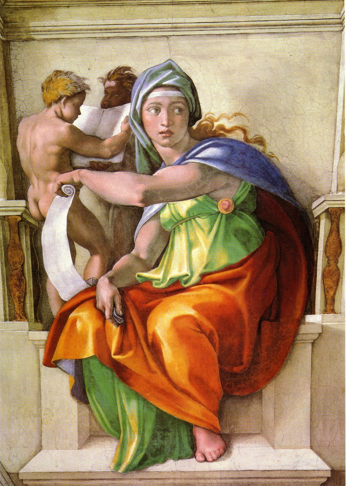
Le mie pennellate costruivano anche la distanza
Anche il modo in cui utilizzavo il pennello cambiava in relazione alla posizione delle figure nello spazio dipinto. Non volevo che ogni parte della volta avesse la medesima definizione e la medesima densità di segno.
Per la volta utilizzai pennelli relativamente piccoli, spesso aprendone i peli a ventaglio con la pressione delle dita, secondo una pratica già raccomandata dalla tradizione della pittura, e con questi strumenti costruivo lentamente l’immagine attraverso una fitta trama di pennellate, spesso incrociate, estremamente controllate e attente alla definizione delle forme previste dal cartone.
Nelle parti più vicine allo spettatore infittivo maggiormente il segno, fino a rendere la superficie quasi completamente ricoperta dalla trama delle pennellate; quando invece la figura o l’elemento architettonico si allontanava, cominciavo a diradare progressivamente il gesto, lasciando che la superficie diventasse più aperta e meno definita.
Ancora più lontano lasciavo al pennello una libertà maggiore. Il risultato era una progressiva perdita di definizione che produceva un effetto di sfocatura e contribuiva a far percepire la profondità.

Nella pittura continuavo a ragionare da scultore
Questo modo di procedere può ricordare ciò che accade nella lavorazione della pietra, perché anche nella scultura il grado di definizione della superficie può cambiare in funzione della distanza e dell’effetto che si desidera ottenere.
Nella pittura della volta applicai qualcosa di simile alla logica dello scalpello: la pennellata diventava più fitta e precisa dove volevo concentrare l’attenzione e più rarefatta nelle zone che dovevano arretrare nello spazio.
Anche quando tenevo un pennello in mano continuavo a pensare come uno scultore.
Nelle lunette cambiava completamente il modo di dipingere
Se dalla volta si passa alle lunette, la differenza diventa evidente. Lì la pennellata assume un carattere molto più rapido, libero e immediato, anche attraverso l’impiego di pennelli generalmente più larghi.
Sulla volta il cartone aveva costituito uno strumento fondamentale per la costruzione delle immagini, mentre nelle lunette l’assenza del cartone mi portò verso un’esecuzione più veloce e diretta.
L’immagine veniva costruita soprattutto attraverso grandi piani di colore, senza la necessità di definire minuziosamente ogni dettaglio.
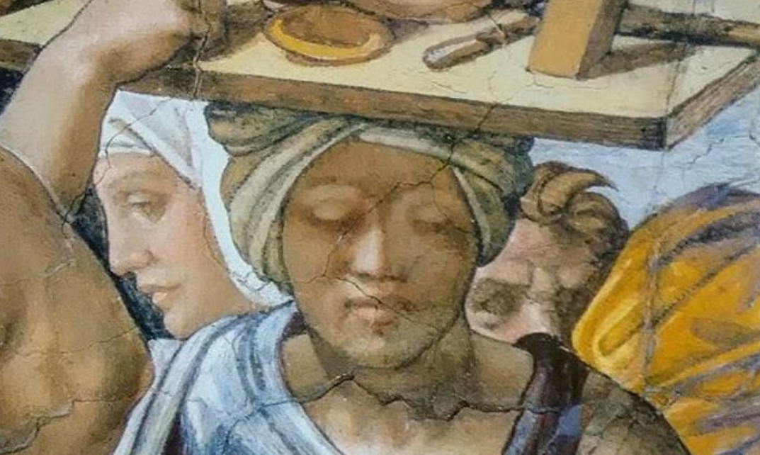
La Sistina va guardata anche nella sua materia
Quando osservate la volta della Cappella Sistina, dunque, provate a non fermarvi soltanto alla grandiosità delle figure e alla complessità delle storie rappresentate, ma cercate di guardare anche ciò che accade sulla superficie.
Dietro ogni corpo, ogni panneggio e ogni volto esiste una precisa scelta di pigmenti, una particolare diluizione del colore, una diversa densità della pennellata e un rapporto studiato fra luce, forma e distanza.
Guardate le figure in primo piano e poi quelle più lontane.
Osservate come la pennellata si infittisce oppure si dirada, come il colore cambia per suggerire la luce e come la superficie dipinta riesca a conservare una straordinaria energia nonostante la sua apparente leggerezza.
Nella grandiosità della Cappella Sistina, c’è anche una pittura fatta di gesti sottilissimi, di colori diluiti e di decisioni tecniche prese direttamente sull’intonaco fresco.
Per il momento il sempre vostro Michelangelo Buonarroti vi saluta dandovi appuntamento ai prossimi post e sui social.
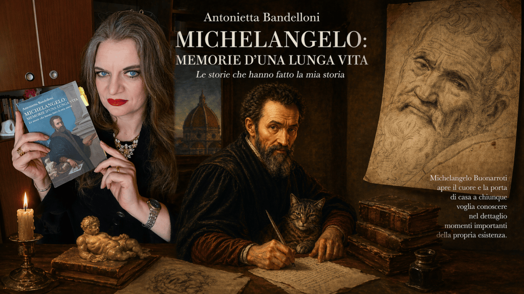
How the Sistine Chapel ceiling frescoes were painted: pigments, colors, and brushstrokes
When you look up at the ceiling of the Sistine Chapel today, you are drawn in by the power of the figures, the monumentality of the bodies, the complexity of the scenes, and the extraordinary luminosity of the whole.
Try also to consider what lies beneath that seemingly solid surface; for every color you see, every tonal variation, and every brushstroke that helps build a figure is the result of a precise technical choice—one made while working on the fresh plaster and while learning, day by day, to better understand the materials used to create those images.
I never viewed color as a mere decorative element to be added to a finished drawing. For me, color had to serve a structural function: it had to help give weight and substance to the bodies, suggest depth, make light perceptible, and—above all—transform a curved, static surface into a space capable of holding figures that seemed almost to step out of the architecture.
The palette I used on the ceiling
The palette I employed for the Sistine Chapel ceiling consisted primarily of pigments traditionally used in buon fresco painting—earths and oxides—supplemented by bianco di San Giovanni (lime white) and vine black. These materials allowed for a color range far richer than the relative simplicity of the available pigments might suggest at first glance.
Among the blues, lapis lazuli was the most expensive. Since Pope Julius II della Rovere required me to pay for the colors upfront, I used it sparingly. I executed the large blue areas of the ceiling using smaltino (smalt), which was far less costly.
At the start of the work on the ceiling, my palette was broader and more experimental. In fact, for the first section of the vault—between the Stories of Noah and the lunettes below—I used certain pigments that technical tradition, dating back to Cennino Cennini, deemed unsuitable for fresco painting.
These included copper resinate (found in the lunettes of Eleazar, Arpachshad, and Zerubbabel), malachite, and red pigments such as cinnabar and red lead—often mixed with earth pigments to achieve specific color variations.
That choice stemmed primarily from a desire to expand my palette. I did not want the fresco technique to limit the variety of images I envisioned. Time and experience would eventually teach me just how vulnerable some of those materials were to moisture.
The Flood taught me the fragility of the painting
The vault’s initial scenes still bear traces of a painting style slightly different from the one I would adopt later on. In The Flood, the paint retains a certain body and visible brushstroke thickness—qualities that would gradually diminish as the work progressed.
Dampness and water seepage damaged parts of the painting, forcing me to intervene; consequently, The Flood had to be largely repainted, and The Drunkenness of Noah required retouching a secco (on the dry plaster).
That experience was significant, as it made me acutely aware of the vulnerability of certain pigments and the impact moisture could have on the painted surface.
From The Fall of Man onwards, some of the pigments I had used in the first section of the vault disappeared from my palette, and my method of applying paint evolved, becoming increasingly thin and fluid.
I did not want to cover the plaster; I wanted it to breathe
I was not in the habit of applying paint in a heavy, opaque manner. I much preferred using extremely diluted glazes layered one over another—a process that, in some respects, recalls watercolor painting—because the underlying tone remained visible and contributed to the construction of the image.
This transparency was fundamental to me. I wanted not merely to deposit a layer of pigment onto the plaster surface, but to slowly build up the form through a succession of stages, allowing the underlying color, the surface itself, and the light to all contribute to the final result.
As the work progressed, this characteristic became increasingly evident: moving from the relative substance of the initial scenes, I shifted to progressively more fluid applications, eventually arriving—in the final sections of the vault—at a style of painting that was extremely thin and almost watercolor-like.
It is precisely thanks to this minimal use of paint that the surface has managed to retain such extraordinary legibility over the centuries, despite the fact that water seepage and salt formation have, in some points that attacked and granulated the painted surface.
For me, color served to construct the light
Color itself had to play a part in constructing form and help make visible the way light settles upon bodies.
In my conception, the light ideally originated from an undefined point located beyond and above the altar, reaching the figures from various angles; it brought out muscles, twists, volumes, and drapery, creating a luminous continuity that spanned the entire architecture of the vault.
That is why, in the Sistine Chapel, color performs a structural function rather than a merely decorative one.
It is color that gives substance to form; it is color that suggests light; and it is color, too, that contributes to the perception of three-dimensionality.
Cangiante instead of chiaroscuro
I relied primarily on the tonal value of color and made far less use of traditional chiaroscuro than one might imagine when observing the monumentality of the figures today.
I preferred cangiante—the transition between different color hues—because through these variations I could build planes of light and emphasize volume without relying solely on the contrast between light and shadow.
I wanted to achieve a luminous style of painting, one capable of keeping the figures clearly legible even as lighting conditions within the chapel shifted and the atmosphere of the space changed.
Light had to prevail over shadow, and color had to become the instrument for achieving that desired result.
My brushstrokes also established a sense of distance
The way I used the brush also varied according to the figures’ positions within the painted space. I did not want every part of the vault to possess the same level of definition or the same density of mark-making. For the vault, I used relatively small brushes—often fanning out the bristles with finger pressure, a technique long established in painting tradition—and with these tools, I slowly built up the image through a dense network of brushstrokes. These were often cross-hatched, extremely controlled, and focused on defining the forms outlined in the cartoon.
In areas closer to the viewer, I made the marks denser, eventually covering the surface almost entirely with the weave of brushstrokes; conversely, as a figure or architectural element receded into the distance, I progressively spaced out my strokes, allowing the surface texture to become more open and less defined.
At even greater distances, I granted the brush greater freedom. The result was a gradual loss of definition that created a blurring effect, helping to convey a sense of depth.
While painting, I continued to think like a sculptor
This approach is reminiscent of stone carving, as the degree of surface definition in sculpture also varies depending on the distance and the desired effect.
When painting the vault, I applied a logic similar to that of the chisel: brushstrokes became denser and more precise where I wanted to focus attention, and sparser in areas intended to recede into the background.
Even with a brush in hand, I continued to think like a sculptor.
My painting style changed completely in the lunettes
Moving from the vault to the lunettes, the difference becomes striking. There, the brushwork takes on a much faster, freer, and more spontaneous character, aided by the use of generally wider brushes.
While the cartoon had been a fundamental tool for constructing the images on the vault, its absence in the lunettes led me to a faster, more direct execution.
The image was built primarily through large planes of color, without the need to meticulously define every detail. The Sistine Chapel should also be viewed in terms of its material substance.
When you gaze at the ceiling of the Sistine Chapel, then, try not to stop at the grandeur of the figures and the complexity of the stories depicted; instead, try to look at what is happening on the surface itself.
Behind every body, every fold of drapery, and every face lies a precise choice of pigments, a specific dilution of color, a varying density of brushstrokes, and a carefully considered relationship between light, form, and distance.
Look at the figures in the foreground and then at those further away.
Observe how the brushwork becomes denser or sparser, how the color shifts to suggest light, and how the painted surface retains an extraordinary energy despite its apparent lightness.
Amidst the grandeur of the Sistine Chapel, there is also a style of painting composed of incredibly subtle gestures, diluted colors, and technical decisions made directly upon the fresh plaster.
For now, your ever-faithful Michelangelo Buonarroti bids you farewell.
Sostienici – Support Us
Se questo blog ti piace e ti appassiona, puoi aiutarci a farlo crescere sempre più sostenendoci in modo concreto condividendo i post, seguendo le pagine social e con un contributo che ci aiuta ad andare avanti con il nostro lavoro di divulgazione. . ENGLISH: If you like and are passionate about this blog, you can help us make it grow more and more by supporting us in a concrete way by sharing posts, following social pages and with a contribution that helps us to move forward with our dissemination work.
10,00 €
-
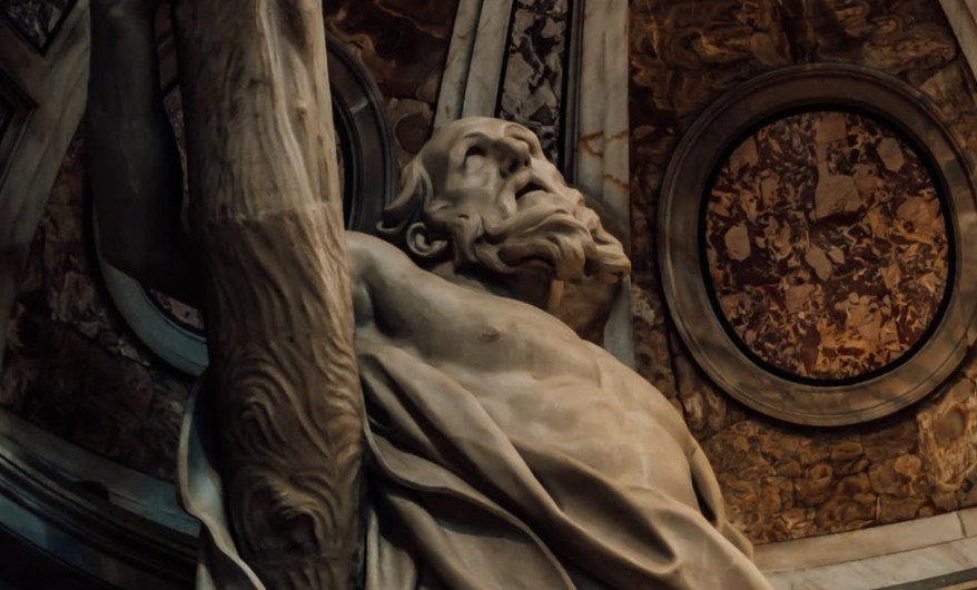
François Duquesnoy: quando la scultura cercò la grazia
🇮🇹François Duquesnoy, lo scultore fiammingo che conquistò Roma. Dal Sant’Andrea in San Pietro alla Santa Susanna, la sua sfida a Bernini nel segno della grazia e dell’armonia classica.
-
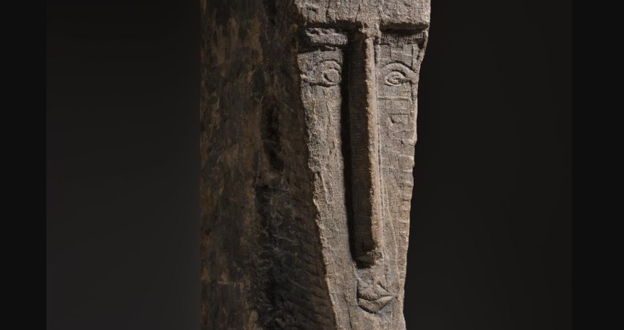
Modigliani, scultura da 35 milioni di dollari: Tête all’asta dopo 50 anni
🇮🇹Una rarissima scultura di Modigliani torna all’asta dopo oltre 50 anni: Tête, del 1911-1912, è stimata fino a 35 milioni di dollari… 🇬🇧A very rare Modigliani sculpture returns to auction after more than 50 years: Tête (1911–1912) is estimated at up to $35 million…
-
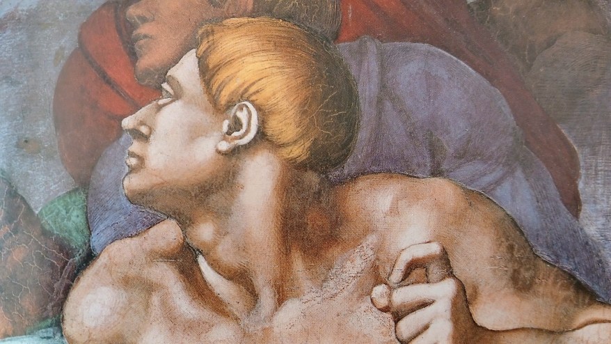
Il taglio a scodella nel Cinquecento: la curiosa acconciatura che compare nel Giudizio Universale della Sistina
🇮🇹Prima dei caschetti moderni e delle tendenze lanciate dai parrucchieri, nel Cinquecento esistevano già acconciature che ricordano sorprendentemente quelle di oggi e nel Giudizio Universale si vede bene… 🇬🇧<Long before modern bobs and trends set by hairstylists, 16th-century hairstyles existed that are surprisingly reminiscent of today's styles—as clearly seen in *The Last Judgment*…
Condividi:


Questo sono io



sostienici

Sostienici – Support Us
Se questo blog ti piace e ti appassiona, puoi aiutarci a farlo crescere sempre più sostenendoci in modo concreto condividendo i post, seguendo le pagine social e con un contributo che ci aiuta ad andare avanti con il nostro lavoro di divulgazione. . ENGLISH: If you like and are passionate about this blog, you can help us make it grow more and more by supporting us in a concrete way by sharing posts, following social pages and with a contribution that helps us to move forward with our dissemination work.
€10,00


