

Michelangelus: la mia grafia diventa un font digitale
La mia grafia diventa un carattere digitale: si chiama Michelangelus, nasce dalla mia scrittura e dalla mia firma e porta nel mondo contemporaneo un frammento del mio modo di tracciare lettere, spazi e forme.
È nato infatti Michelangelus, il nuovo carattere tipografico commissionato dalla Fabbrica di San Pietro in Vaticano, realizzato da studiogusto® e sviluppato per l’ecosistema Microsoft Office. Un progetto nel quale la mia grafia rinascimentale incontra il disegno vettoriale, la ricerca storica e la tecnologia contemporanea.
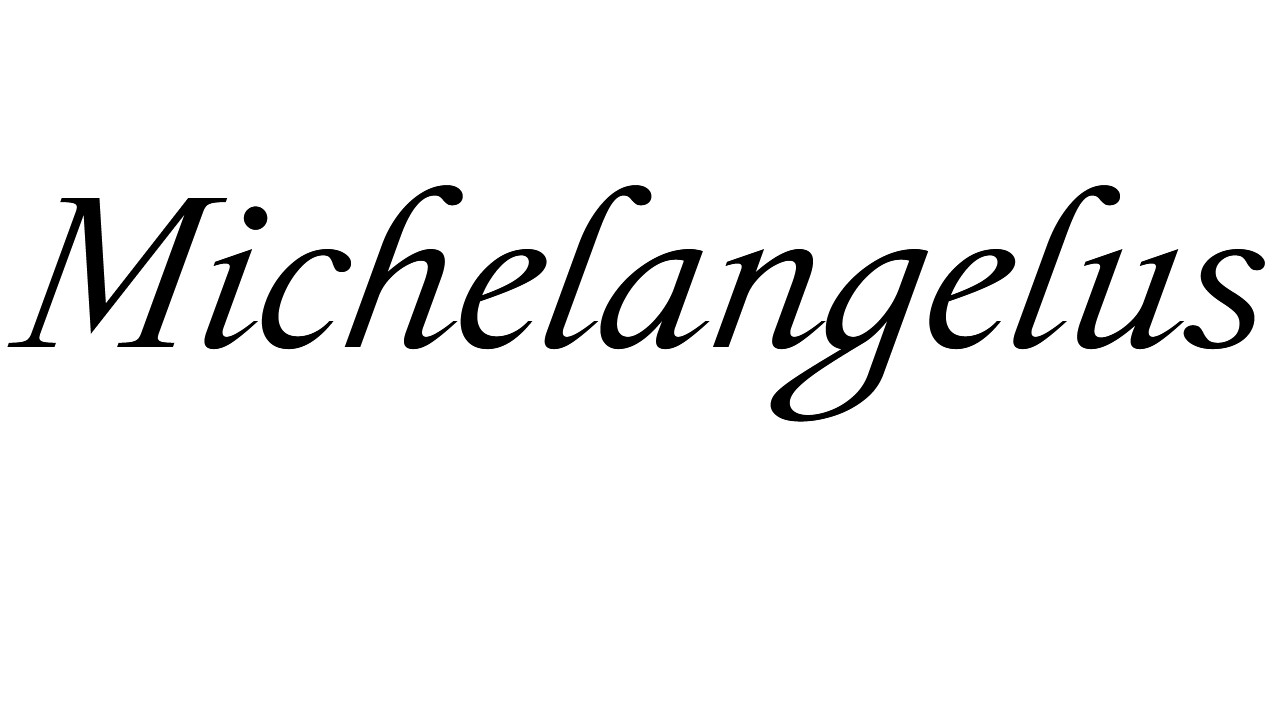
La mia firma è diventata una forma digitale
La scrittura tradisce sempre qualcosa di chi la produce. La pressione della mano, la velocità, le pause, le inclinazioni, il modo di costruire una lettera e persino quello di lasciare bianco lo spazio intorno al segno raccontano una persona forse più di quanto immagini.
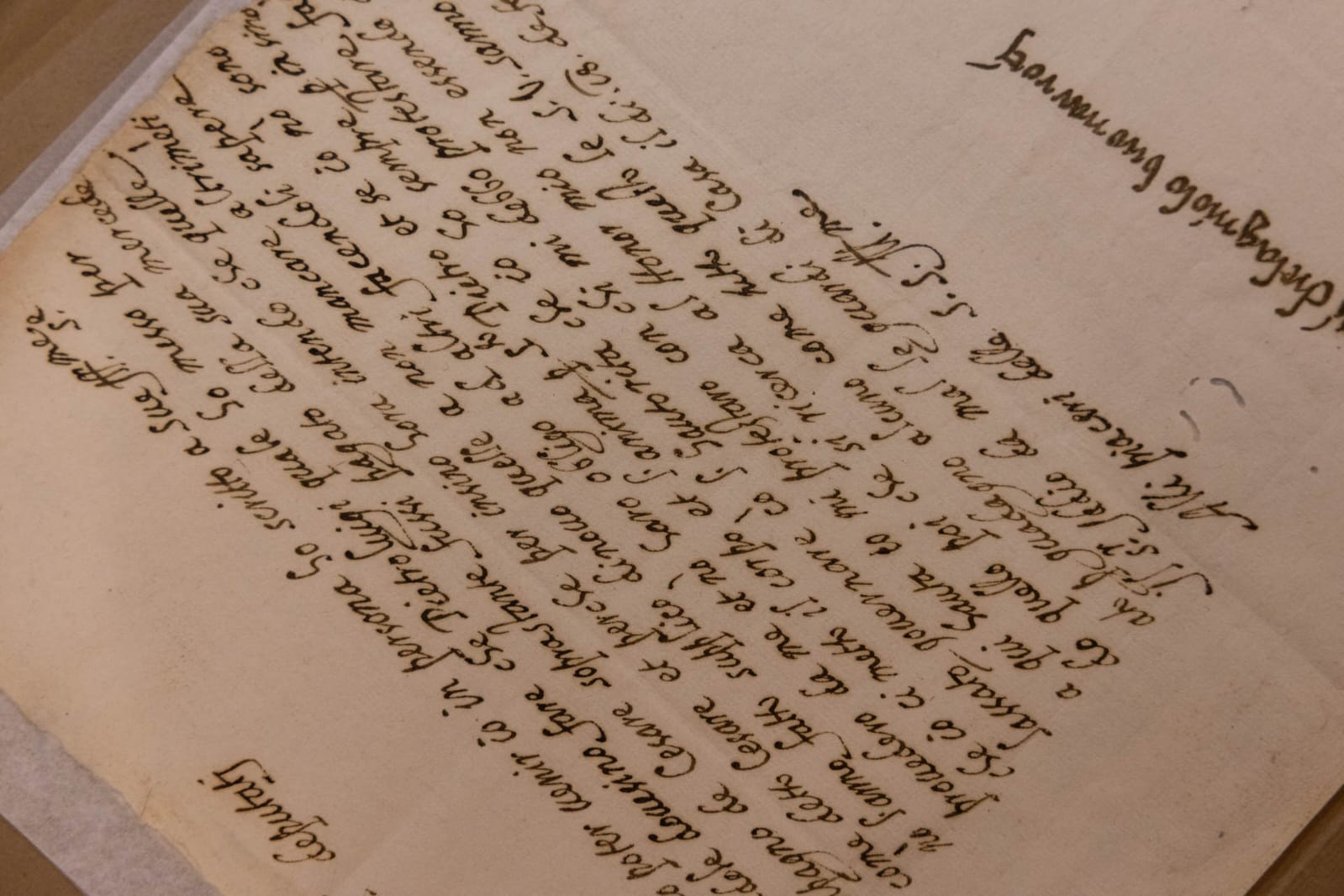
Nel mio caso, i progettisti di Michelangelus hanno studiato lettere, appunti, firme e documenti originali conservati negli archivi della Fabbrica di San Pietro, nell’Archivio Apostolico Vaticano e a Casa Buonarroti a Firenze.
Una scrittura autentica è fatta però anche di imperfezioni, accelerazioni, esitazioni e gesti irripetibili. Un carattere tipografico, invece, deve essere coerente: una lettera deve poter essere riprodotta migliaia di volte mantenendo sempre la stessa identità.
Bisognava dunque capire che cosa rendesse riconoscibile la mia scrittura, separando il gesto occasionale dalle strutture ricorrenti. In altre parole, hanno cercato l’ordine nascosto dietro la mia mano.
A quanto pare l’hanno trovato.
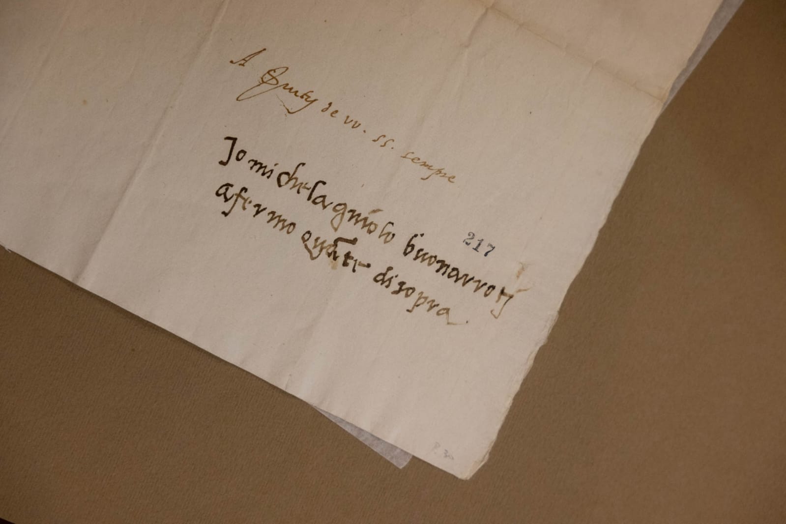
C’è una piccola architettura anche nella mia scrittura
Io ho sempre avuto un rapporto molto particolare con la misura, la proporzione, l’equilibrio e lo spazio. Che si trattasse di una figura scolpita nel marmo, di una superficie affrescata o di un edificio, nulla poteva essere lasciato completamente al caso.
Lo stesso principio emerge anche nella mia scrittura. Michelangelus nasce proprio dall’analisi di questa tensione fra energia e controllo: le linee possono essere vigorose, il gesto può apparire rapido e personale, ma sotto quella immediatezza esiste una struttura.
Sono state studiate le proporzioni delle lettere, le inclinazioni, le terminazioni, il rapporto tra spazio pieno e spazio vuoto e il ritmo complessivo della scrittura.
Più di 500 glifi per portare Michelangelo nel computer
Michelangelus comprende oltre 500 glifi ed è disponibile in quattro stili: Regular, Italic, Bold e Bold Italic.
È stato concepito come un vero sistema tipografico, leggibile e versatile, utilizzabile sia nella stampa sia negli ambienti digitali e sviluppato per essere integrato nell’ecosistema Microsoft 365 Office.
Questo carattere può essere utilizzato gratuitamente. Il progetto prevede infatti la possibilità di scaricare il font e installarlo, permettendo a persone e organizzazioni di utilizzarlo nel rispetto della licenza prevista per la famiglia tipografica.
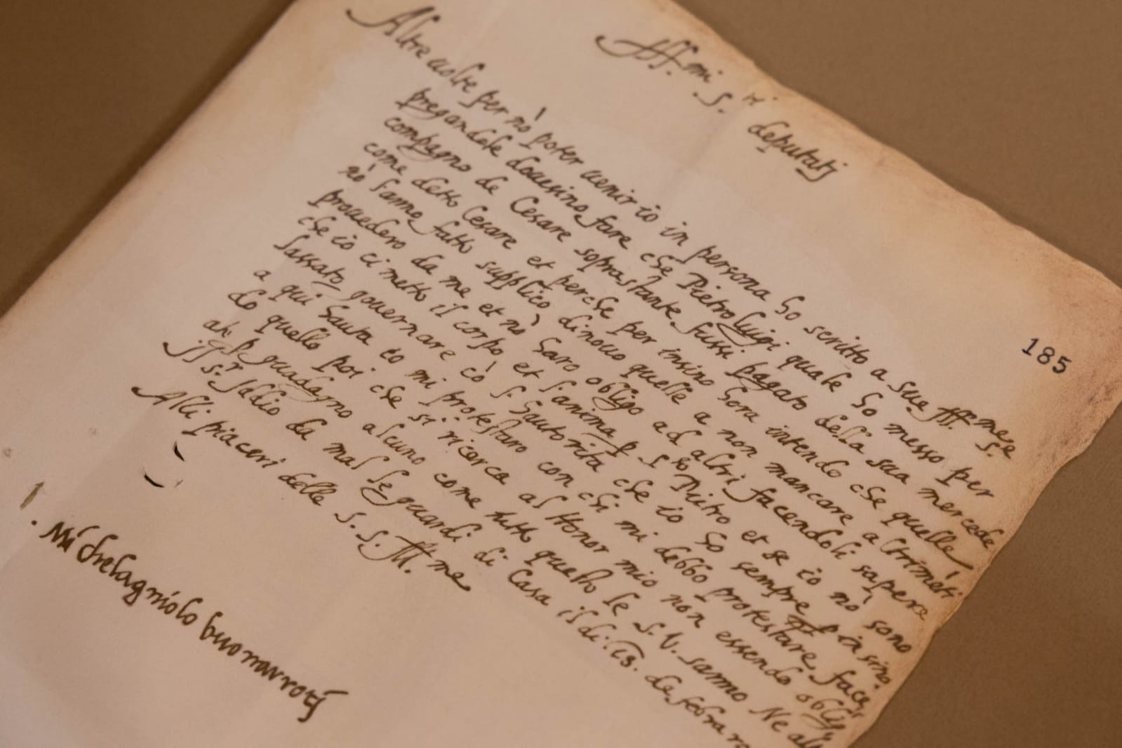
E pensare che mi lamentavo della grafia di mio nipote
Sapete, ero poco indulgente nei confronti della grafia altrui. Lo sapeva bene mio nipote Lionardo Buonarroti.
In una delle mie lettere gli rimproveravo proprio la sua scrittura, lamentando la fatica che serviva per riuscire a leggerla. Arrivai persino a dirgli, con la delicatezza che m’apparteneva, che persino scrivendo al più grande asino del mondo avrebbe usato più cura di quanta ne usasse con me.
Lionardo continuò a scrivere con la medesima grafia e io continuai a lamentarmi.
«Non scrivermi più: ogni volta che arriva una tua lettera mi viene la febbre per la fatica che faccio a leggerla! Non riesco a immaginare dove tu abbia imparato a scrivere. Credo che, se dovessi scrivere al più grande asino del mondo, useresti più cura di quanta ne usi con me. Dunque, non aggiungere altri fastidi a quelli che già ho».
Alla fine io ho sempre cercato di dare forma alla materia e adesso qualcuno ha preso la forma della mia scrittura e l’ha trasformata in qualcosa che può essere utilizzato, modificato, stampato, condiviso e trasmesso in tutto il mondo.
Per il momento il sempre vostro Michelangelo Buonarroti vi saluta dandovi appuntamento ai prossimi post e sui social.
Michelangelus: my handwriting becomes a digital font
My handwriting has become a digital typeface: it is called Michelangelus. Born from my script and signature, it brings a fragment of the way I shape letters, spaces, and forms into the contemporary world.
Michelangelus is the new typeface commissioned by the Fabbrica di San Pietro in the Vatican, created by studiogusto® and developed for the Microsoft Office ecosystem. It is a project where my Renaissance handwriting meets vector design, historical research, and modern technology.
My signature has become a digital form
Handwriting always reveals something about the person who produces it. Hand pressure, speed, pauses, slant, the way a letter is constructed, and even the empty space left around the mark—all these tell a story about a person, perhaps more than one might imagine.
In my case, the designers of Michelangelus studied original letters, notes, signatures, and documents preserved in the archives of the Fabbrica di San Pietro, the Vatican Apostolic Archive, and Casa Buonarroti in Florence.
Yet, authentic handwriting is also made of imperfections, bursts of speed, hesitations, and unrepeatable gestures. A typeface, on the other hand, must be consistent: a letter must be reproducible thousands of times while always retaining the same identity.
They therefore had to understand what made my handwriting recognizable, distinguishing the occasional gesture from recurring structures. In other words, they sought the hidden order behind my hand.
It seems they found it.
There is a touch of architecture in my handwriting, too
I have always had a very particular relationship with measurement, proportion, balance, and space. Whether it was a figure carved in marble, a frescoed surface, or a building, nothing could be left entirely to chance. The same principle emerges in my handwriting as well. Michelangelus was born precisely from an analysis of this tension between energy and control: the lines may be vigorous, and the stroke may appear rapid and personal, yet beneath that immediacy lies a structure.
Careful study went into the letter proportions, slants, terminals, the balance between positive and negative space, and the overall rhythm of the script.
Over 500 glyphs to bring Michelangelo to the computer
Michelangelus comprises more than 500 glyphs and is available in four styles: Regular, Italic, Bold, and Bold Italic.
It was conceived as a true typographic system—legible and versatile—suitable for both print and digital environments, and developed for integration into the Microsoft 365 Office ecosystem.
This typeface is free to use. The project allows individuals and organizations to download and install the font, provided they adhere to the typeface family’s license terms.
And to think I used to complain about my nephew’s handwriting
You know, I was not very forgiving when it came to other people’s handwriting. My nephew, Lionardo Buonarroti, knew this all too well.
In one of my letters, I actually scolded him for his handwriting, complaining about the effort required to read it. I even went so far as to tell him—with my characteristic delicacy—that he would take more care writing to the world’s biggest jackass than he did when writing to me.
Lionardo kept writing in the same hand, and I kept complaining.
“Do not write to me anymore: every time a letter of yours arrives, I get a fever from the strain of trying to read it! I cannot imagine where you learned to write. I believe that if you were writing to the world’s biggest jackass, you would take more care than you do with me.” So, do not add any further annoyances to the ones I already have.”
In the end, I have always sought to give form to the material, and now someone has taken the form of my writing and transformed it into something that can be used, modified, printed, shared, and transmitted across the globe.
For now, your ever-faithful Michelangelo Buonarroti bids you farewell, looking forward to seeing you in future posts and on social media.
Sostienici – Support Us
Se questo blog ti piace e ti appassiona, puoi aiutarci a farlo crescere sempre più sostenendoci in modo concreto condividendo i post, seguendo le pagine social e con un contributo che ci aiuta ad andare avanti con il nostro lavoro di divulgazione. . ENGLISH: If you like and are passionate about this blog, you can help us make it grow more and more by supporting us in a concrete way by sharing posts, following social pages and with a contribution that helps us to move forward with our dissemination work.
10,00 €
Condividi:


Questo sono io



sostienici

Sostienici - Support Us
Se questo blog ti piace e ti appassiona, puoi aiutarci a farlo crescere sempre più sostenendoci in modo concreto condividendo i post, seguendo le pagine social e con un contributo che ci aiuta ad andare avanti con il nostro lavoro di divulgazione. . ENGLISH: If you like and are passionate about this blog, you can help us make it grow more and more by supporting us in a concrete way by sharing posts, following social pages and with a contribution that helps us to move forward with our dissemination work.
€10,00


